Friday 29 July 2016
Wednesday 8 June 2016
FORM FUNCTION RELATIONSHIP
The principle of form follows function was first mentioned by the American sculptor Horatio Greenough in 1852 for the first time. While sometimes attributed to sculptor Horatio Greenough, the phrase “form follows function” was coined by American architect Louis Sullivan.
Function
“Function” is derived from the Latin term “functio” and means “accomplishment” in its original sense. Function defines for which purpose something can be used. The concept of function can be viewed from different perspectives. A usability expert will tend to think of functions that serve to achieve a goal efficiently. In his many examples from nature, Sullivan included not only this interpretation of function. He interprets the term “function” in a much more comprehensive sense.
Form
“Form” can be equated with the term aesthetics. Aesthetics is derived from the Greek word “aisthesis” which means “perception” and “sensation”. Aesthetics is all about how we perceive and interpret the world through our five senses. Thus, the statement “that is aesthetically” does not merely mean “that something looks beautiful”. Accordingly, aesthetics is not just about the visual part of our perception.
Art is a typical example of a strong preponderance of form.
A strong predominance of function leads to boredom. If form is under-represented, the key component emotion is rarely existent.


The Guggenheim Museum is a good example of Wright’s application of the principle. It’s spiral shape was intended to allow visitors to easily view the artwork within.

Plaza De Castilla (Madrid) by Johnson
Johnson claimed that the profession of architecture has no functional responsibility.
Interpreting “Form Follows Function”
There are two ways to interpret the phrase “form follows function”:
Descriptive: beauty results from purity of function;
Prescriptive: aesthetic considerations in design should be secondary to functional considerations.
DESCRIPTIVE INTERPRETATION
The descriptive interpretation favors simplicity to complexity. It states that beauty results from purity of function and not from ornamentation. This ideal derives from the belief that form follows function in nature. Is this really true?
Actually, the opposite is true. Evolution passes on genetic traits to subsequent generations without any rationale for their purpose. Each generation of a species then finds a use for the form it has inherited. Function follows form in nature.
Applying functional elements to a design is generally a more objective process than applying aesthetic elements. A functionally objective process results in designs that are timeless but may be perceived as simple and uninteresting.
PRESCRIPTIVE INTERPRETATION
The prescriptive interpretation prioritizes functionality over all other design considerations, including usability, ergonomics and aesthetics.
Aesthetic considerations in design should be secondary to functional considerations. Is this interpretation problematic? Does it lead designers to ask the wrong questions about a given design?
This interpretation would seem to lead to designers to ask what should be omitted from a design. What elements of a design do not serve a function and thus ought to be removed? Should the form of a design be determined solely by its function?
Taken to the logical conclusion, every element would ultimately have the same design. Every functional item would have one and only one design. Before an object’s form could be changed, it would need to serve a different function.
Better questions come from criteria for success. What aspects of design are critical to success? When time or resources is limited, what design trade-offs would least harm the design’s success? Sometimes, certain aesthetics will have to be abandoned, and sometimes certain functionality will have to be abandoned. Sometimes both aesthetics and functionality will need to be compromised.
Max Luscher's color psychology
Max Luscher a Swiss psychotherapist. He's known for inventing the Lüscher color test, a tool for measuring the person's psychophysical state based on his or her color preferences.
He concluded following color codes:
Blue: Contentment
Feeling of belonging, the inner connection and the relationship to one’s partner.
"How I feel towards a person that is close to me"
Green: Self-respect
Inner control of willpower and the capacity to enjoy.
"The way I want to be"
Red: Self confidence
Activity, drive and the reaction to challenges.
"How I react to challenges"
Yellow: Development
Attitude of anticipation, attitude towards future development and towards new encounters.
"What I expect for the future"
TAKE THE LUSCHER COLOR TEST NOW
Placement in Design


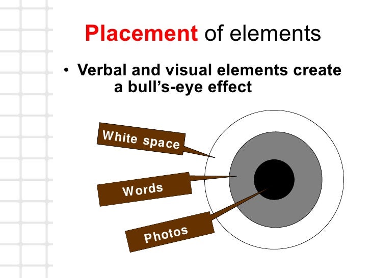

The grid-shaped rule of thirds concept helps you understand the places on an image where a person is naturally drawn when viewing an image . In theory, the most eye-catching points are where the grid lines intersect.
Understanding where these key points fall can help you better compose a piece of artwork or photo, determine a more appealing crop and even determine placement of elements. Generally, the area that will first attract attention is the top left grid intersection, followed by the intersection below it and then the top right and bottom right cross-sections.
The biggest lesson to come from the rule of thirds is that perfect 2-part symmetry may not be the most appealing configuration. You will get more impact with images and design without it. (And remember, even if your design is created with perfect symmetry from the center out, the rule of thirds will still apply.)

Subscribe to:
Posts (Atom)